Monday, February 28, 2011

Mechanical Product

The product that I chose to do for this mechanical product was a Nintendo DS game system.


-This was the back view of this product.
-The elements that are included in this picture include: Horizontal and vertical lines, they are both parallel going along with one another.
-The pinciples in this picture include: Rythym, everything is going on a pattern and is in a balanced area to make


-This is the front view of this product.
Something that this gameboy follows from the front view is horizontal lines. All of the lines going horizontal are parallel.

-Some principles include: Proportion, both of the flaps of this item are the same size, making it easier to follow and better.


-This is a side view of this product.

-Some elements include: Texture and color- The texture seems to be smooth, and inviting, as the color is silver which goes along with the smoothnes for a cool slick look.
-Some principles include: Proportionality, both of the lengths of these flaps are the same length.

Wednesday, February 23, 2011

Graphic Design: What's Going On In This Design?::Gillette Fusion


This item came from Wired magazine of July 2010, on page 8.

This item that is being marketed is Gillette fusion deodorant.
 -Jake and I will explain to you about the effective graphic design-
Analysis: Message Content-(Drew/Jake)-The content in this add is solid. It tells us specifically what it is supposed to act as, which is an odor shield anti-perspirant, so one can move on with their life without worrying about their stench.


Size/Shape-(Drew/Jake)-The size and shape of the add seems to be perfect. It takes up a reasonable amount of the page and the text is short enough and precise enough that I won't get bored reading it.

Readability-(Drew/Jake)-The readability of this advertisement also seems great. The white  text contrast the black background which makes it stick out and be easy to read.

Audience-(Drew/Jake)-This does appeal to the audience, which would be younger aged males to middle aged males. The color contrast one another and it looks like an interesting product. It seems unique and would make one want to buy this product.

Use of principles and elements-(Drew/Jake)-This add also also has good uses of the design elements and principles. It has a good use of color, space, and form/shape. It also has good balance of the page, it has emphasis on the product, and has symmetry.

Conclusion/Questions:
1. What are trends? Why is it important to identify them prior to graphic design?
Trends are fashions and things that people like to follow in life, it is what is popular at the moment. It is important to identify them because you want to appeal to your audience, you would put something out that the audience is currently using, not what they used 5 years ago.
2. How does human nature play a role in how a product is marketed to a specific demographic group?
Well, you want to place an add in something that fits it. A good idea would be to place deodorant in a men's magazine because men will use this deodorant. One would not place an add about bra's in a men's magazine because its inefficient and men would not use these.

3. How is an  audience identified?
An audience is identified by their characteristics such as their age, income, job, and their fashion trends.

4. What must you discover about the target audience prior to graphic design?
You must discover what they are into, what they like, and what they are willing to buy and possibly how much money they have to spend on your product.

Challenger Explosion Post-Opt in #2

*This is the challenger during the explosion*
What technical problem caused this accident? Please describe with some detail.
-The main cause of the explosion was the  failure of the aft joint seal in the right SRB due to the cold weather.
-A gas leak in the right SRB initiated at the wrong time and weakened the challenger.

What was the big picture problem that set the conditions for this accident?
-The big problem that caused this accident to overall occur was that the people making the challenger did not have enough time to prepare it.
-Due to not having enough time the challenger was not properly prepared and this was what led to it's explosion.

What implications did this have for the US Space Program? For the nation?
-This caused NASA to suspend space shuttle flight for atleast 2 years, and put the nation into a national tragedy.

What other challenges have the Space Shuttles encountered?
Other space shuttles such as the Columbia have had problems.
-7-8 minutes before the failure, gauges started to loose readings in Columbia's left wing, left landing gear brake system and tyre.
-Temperature and pressure gauges went off scale.
-It eventually broke over central texas.
This was the challenger before the explosion.

Thursday, February 17, 2011

Carnival Cruise

-There was a fire in the engine room and this made it unsafe to travel across seas.

-The crippled line splendor required heavy maintenance, this was a vital part of the ship.

-This unexpected arrival of this ship actually helped the economy in San Diego.

-Since repairs needed to be done on the ship it created a few jobs for people to do and more cash flow was created in San Diego.


The cruise ship Elation sits docked at the San Diego Cruise ship Terminal May 3, 2009 in San Diego, California.  A number of ships have had to divert their passengers to San Diego instead of Mexico destinations because of the Swine Flu. This is a picture of the cruise boat that was docked in San Diego.
Wednesday, February 16, 2011

Visual Design: Elements and Principles

1) What are the 6 Visual Design Elements we discussed in class?
The six visual design elements that we discussed in class are line, color, form/shape, space, texture, and value.

2) What are the 5 Visual Design Principles we discussed in class?
The 5 Visual Design Principles that we discussed in class are blance, rythym, emphasis, proportion and scale, and unity.

3) Locate five items at home or at school that utilize the elements and principles of design. Post an image of each product. List and explain any visual design elements or principles that are evident in that product.

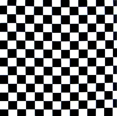
This checker board follows a regular rythym.


This is the sun which is a warm color.


This is a rough road which follows texture.


this is a horiztonal line.

This is a picture with two symbols that have both vertical and horiztonal symmetry.


Friday, February 11, 2011

Design Project

1.) The challenge presented to us was to design a desk organizer that is
made up of atleast 5 different parts. Then we would put the 5 different
parts into one part to make a final desk organizer. My partner is Freddy
Schlichtholz.
2.) I decided to choose this design brief because it interested me in what i could personally come up with as a desk organizer. It was fun putting this together in the CAD software system and i am glad that i chose this one to work on.
3.) Step one in the design process was easy. We knew the problem was making it the correct size and have variety so it could hold different supplies. Step 2 was a little more difficult. We decided to brainstorm on a simple device that would get the job done, and thats when we came up with our design. Step four in the process made our job difficult though. We had to make it atlesat 5 seperate pieces, and the pieces couldnt be that big. Thats why we decided to do boxes all the same size with different designs on each of them. Step 12 of the process was fun. I got the oppurtunity to communicate my results to my teacher and show him what i have put together. He said my project worked out and it wasnt a bad design, it was excactly what i wanted to hear because those words meant that my desk organizer passed.
4.) 3 images of our prior images that we might have gone with::


This first image is a desk organizer that we came up with. It involves a ring with seperate organizers on the ring. You would be able to spin this around to acquire different things from each box.


This was our second design for our desk organizer. This involves having a door on the side and two triangle doors, also with a curved door for optimal space.

This was another design that we implemented which included having 5 seperate desk drawers connected by bars in which u could ultimately open up any door and get whatever you needed.


THE MOST AMAZING PRODUCT EVER
Do you have a dirty desk and dont know what to do?
Try our new desk organizer!                          Desk organizer includes: 5 variety areas.
                                                                                                       area for pencil
                                                                                                                area for tacks/paper clip
                                                                                                                 area for stapler and scotch tape
                                                                                                           area for trash and much more!

               Our new organizer cost only 
15$ to buy! come get it now!
                                                                                                   .